Rethinking University Registration
MAKING SIGNING UP FOR CLASSES EASIER
The university I attend has a confusing registration system when you first use it. Navigating through it becomes easier with experience, trial and error, and tips from more experienced users. I saw a lot of room for improvement mainly in how the search results are displayed, entering search parameters, and planning a schedule.
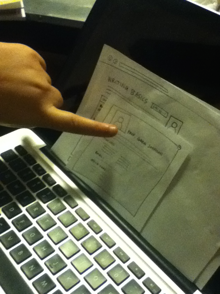
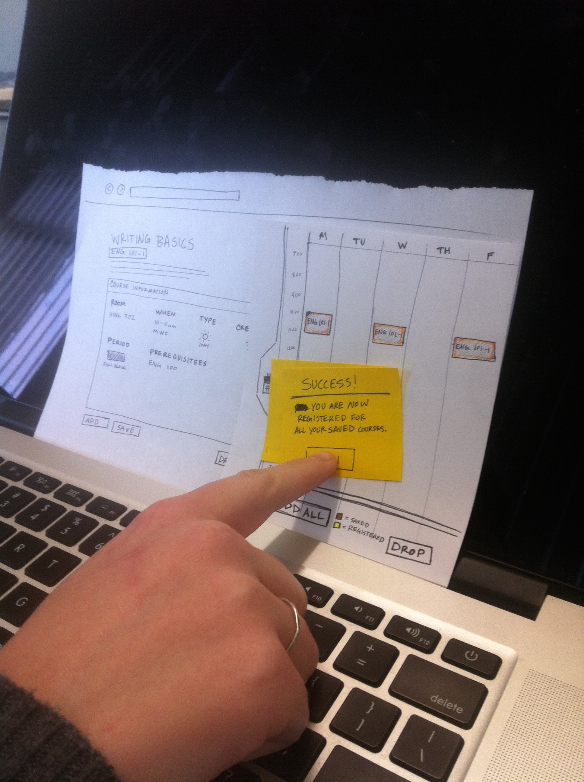
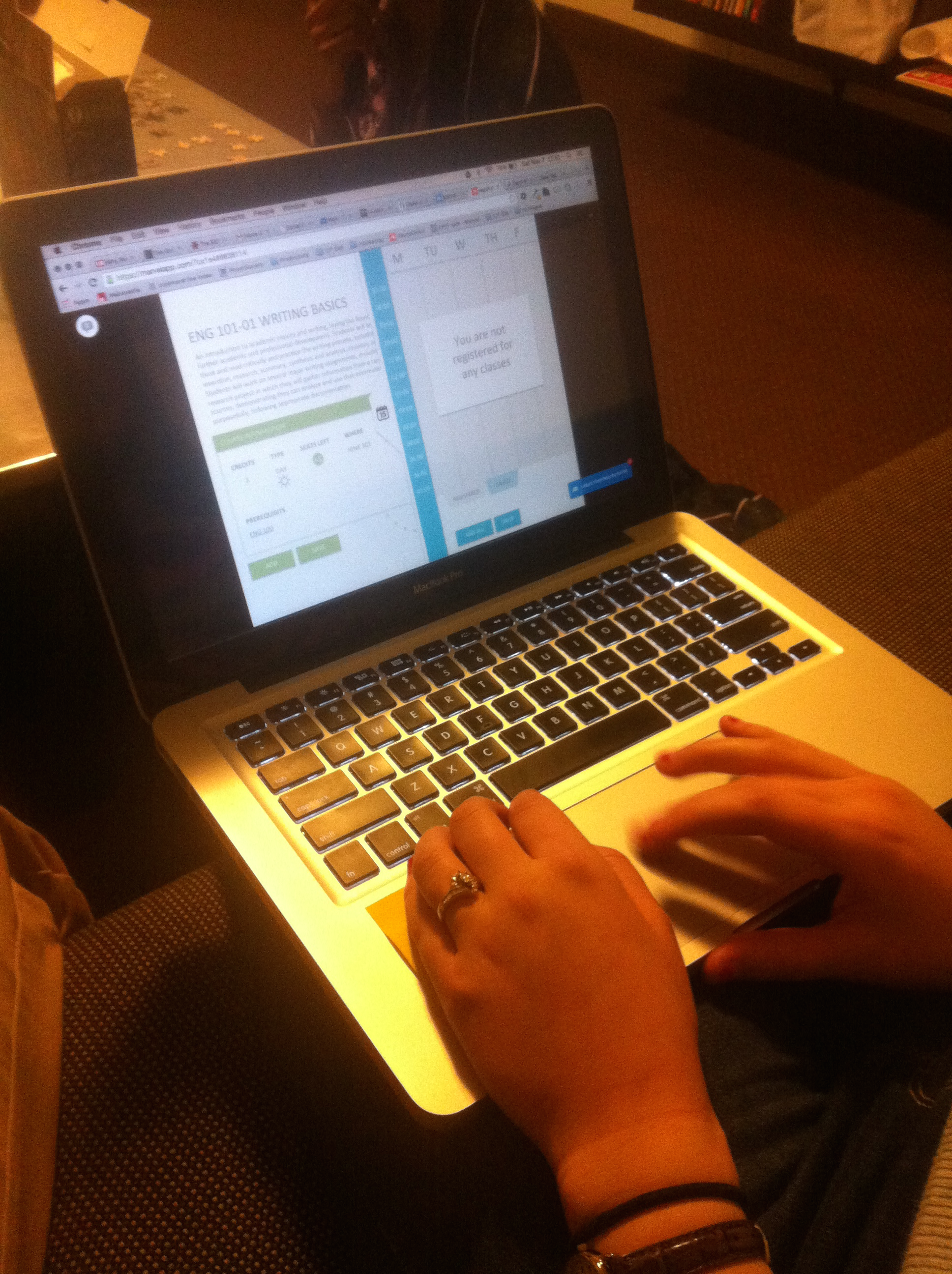
Through usability testing I was able to create a new system with the students in mind. Let me walk you through one of the scenarios I used in the user testing.
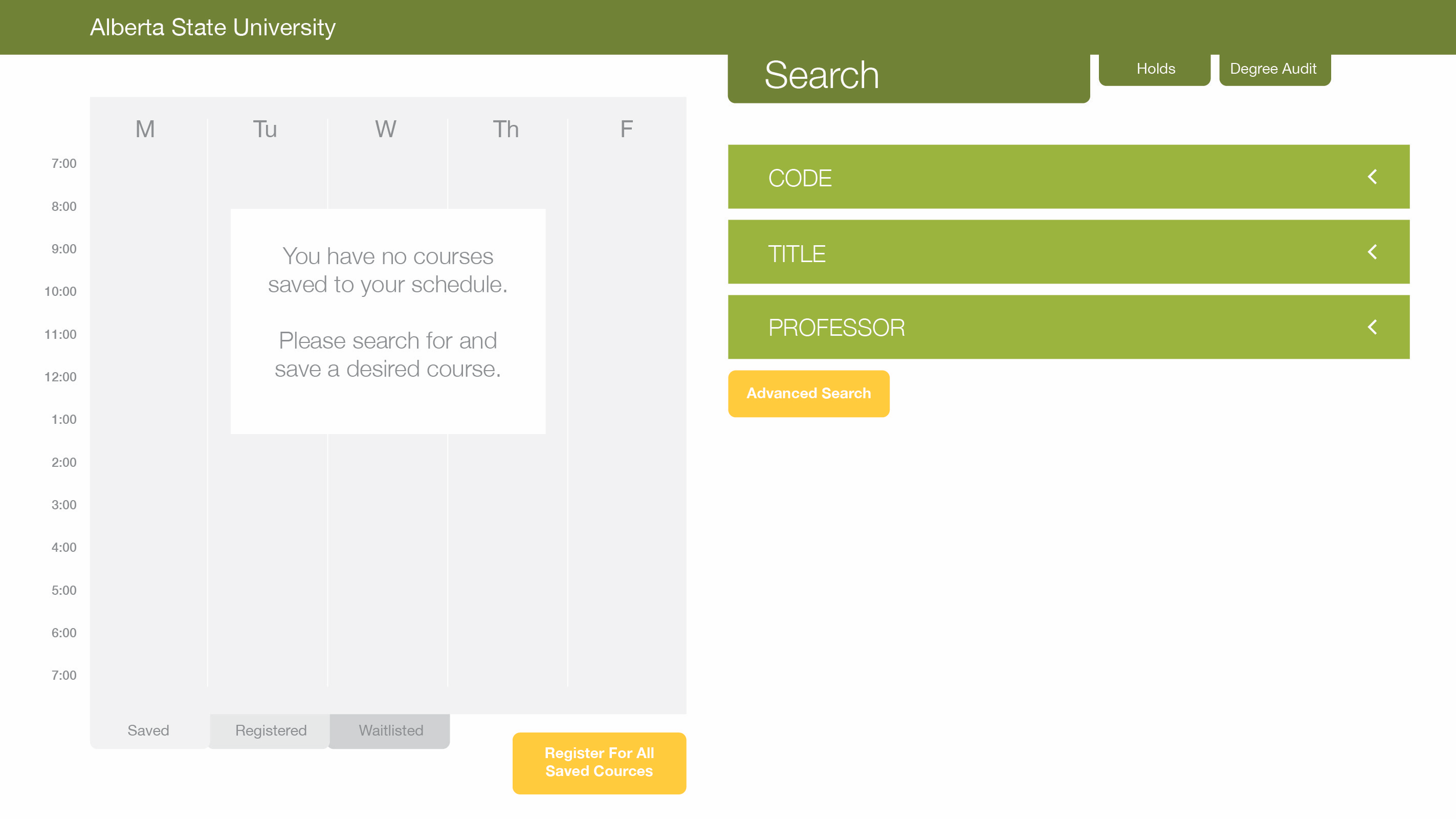
Your day to register for classes at a university is tomorrow. You know hundreds of your fellow students will be rushing to get into the very same classes you would like to be in. To prepare for that rush, you want to plan our your schedule before tomorrow. You start out by searching for Eng 101.
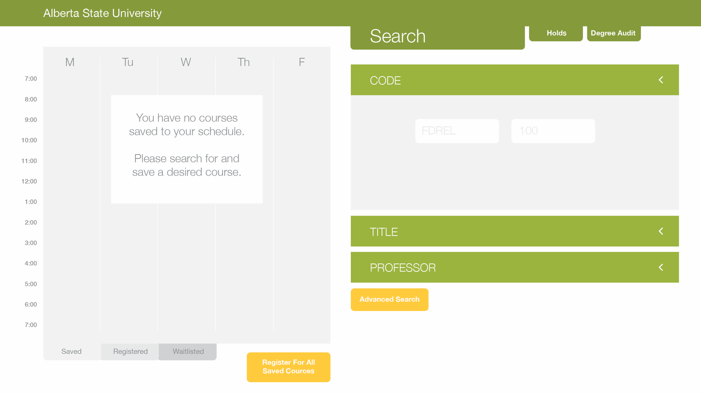
I found the best way to show users what information needs to be entered into a certain field is by example. When you click on the text box the example disappears.
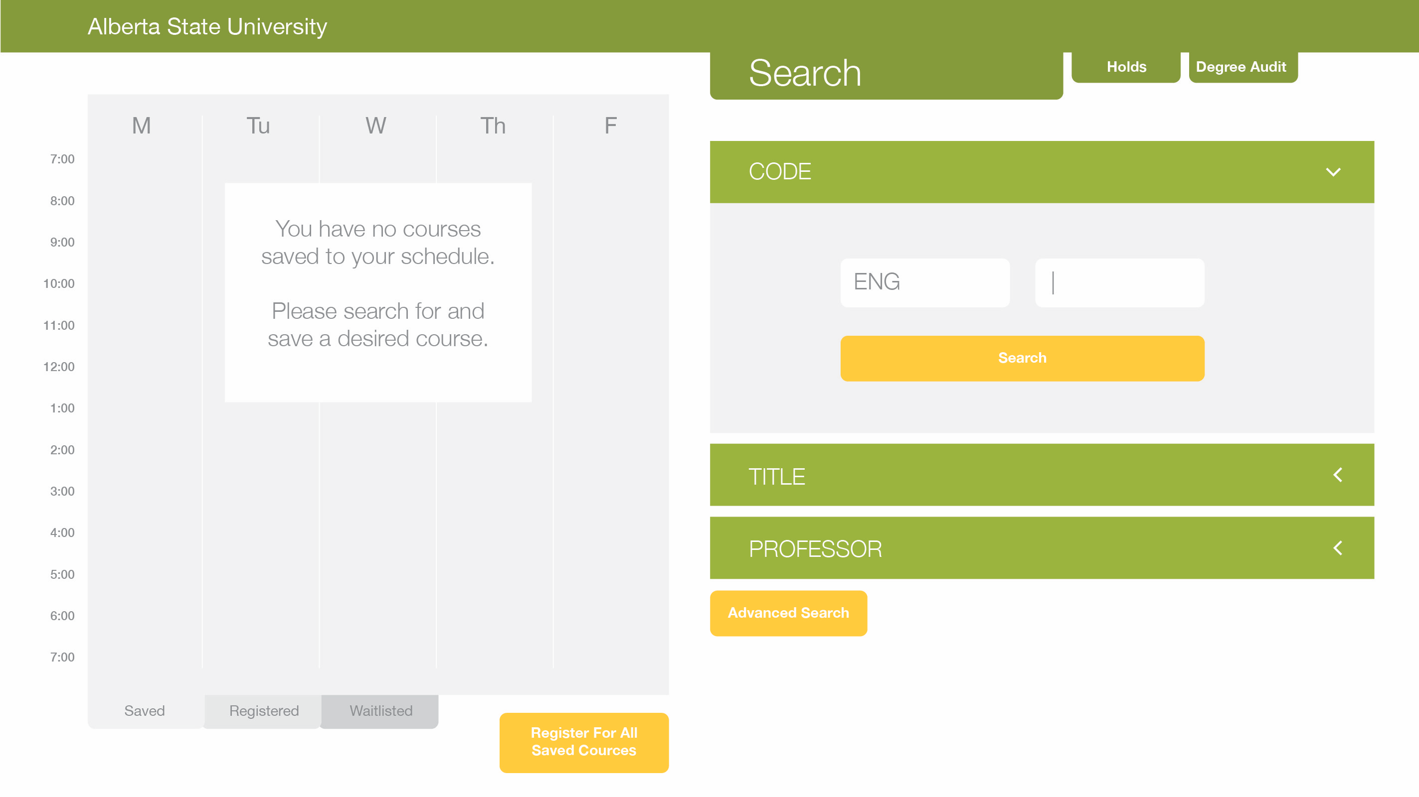
The search button doesn’t appear until some sort of information is entered in the search parameters.
Once everything is entered correctly you press the search button and move on to the next step.

The first class on the results list looks like the best option but you need more information. You click on it.
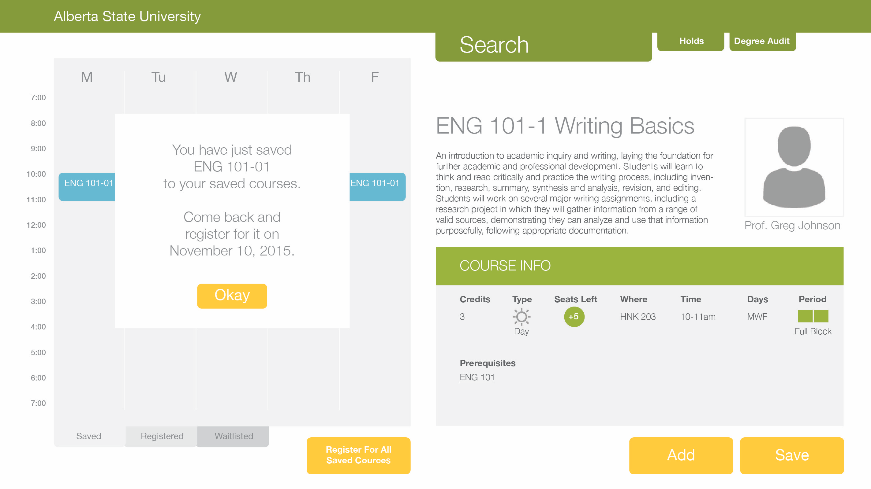
You look over the course details and decide this is the class you need. However, you cannot register until tomorrow so you choose to save it to your calendar.
A window pops up and lets you know you have saved Eng 101-01 to your saved courses (feedback).

If you needed to edit the courses on your schedule, registered or saved, all you would have to do is hover over the course and a drop down menu would appear.
The next day you could come back to your calendar and click one button to register for all of the courses you have saved.
Research
STARTING AT THE BEGINNING
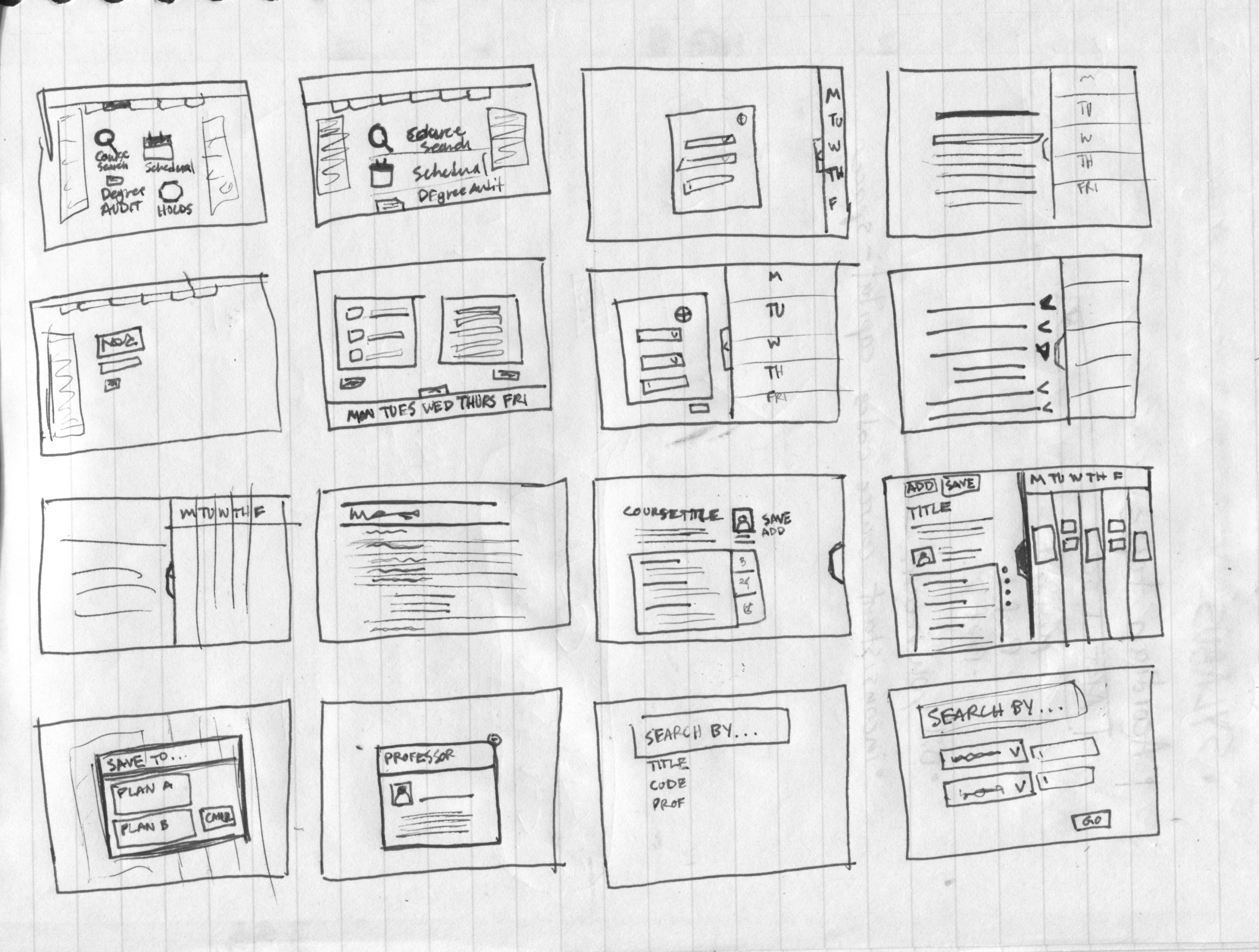
I know I saw a problem with the university course registration system, but I needed to satisfy more than myself to make this redesign successful. I needed to look at what has been done in the past, what universities are doing now and what students would like to see. My research ended with me sitting down with what I learned and sketching some ideas out.
LOOKING BACK TO MOVE FORWARD
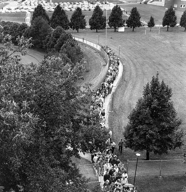
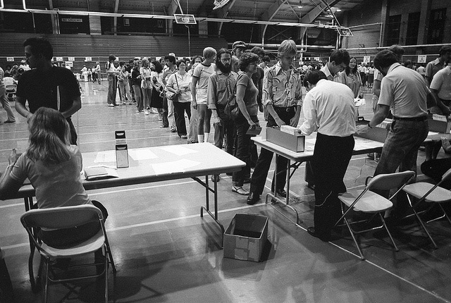
When talking to pre-Internet university graduates about the process they went through I was told about the hours spent waiting in lines in gymnasiums, about the process they when through when they didn’t get into their preferred classes and the overall frustration of the whole experience.
The Internet started being used by universities in the 90s and by moving class registration online, a lot of the time wait was eliminated, but new problems were introduced. Many students from BYU-Idaho become upset when the campus server runs agonizingly slow as hundreds of people attempt to register for classes within the same 20 minutes. It is a race to see if they can get into their list of courses before it becomes full. If this virtual competition of quick clicks and superior server speed was staged in the gymnasiums of the past, there would be no lines or order, only a sea of bodies and bloody noses and no one really wants that.
SYSTEMS UNIVERSITIES USE NOW
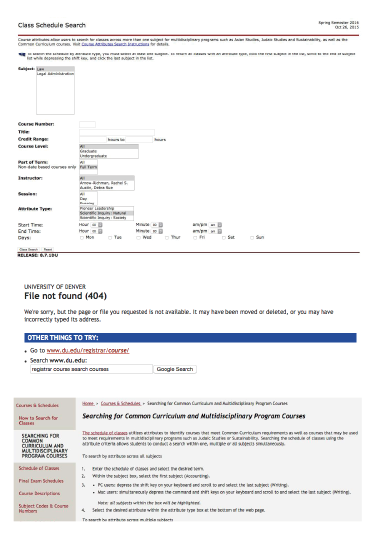
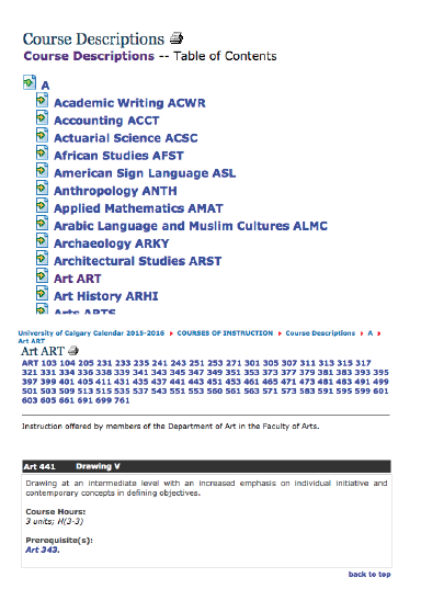
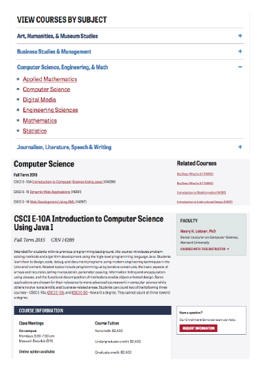
I decided I needed to know what other university registration systems look like. There was one problem, I didn’t have access to any other system other than Brigham Young University – Idaho’s. To work around this issue I decided to researched online catalogs and how classes are organized. Surprisingly there were may different designs.

UNDERSTANDING THE MIND OF A STUDENT
I interviewed 16 Brigham Young University – Idaho students about their experience registering for classes with the current system. Some seemed to like how everything works while others did not have good things to say. It is interesting how people doing the same things have very different experiences.
WHAT I LEARNED
I learned a lot from hearing what theses students had to say. I made a list of features that should be included in my redesign based on these interviews.
- Search by:
- teacher
- course code
- course title
- department/college
- instruction type
- building
- Icons are a must to help with understanding. No one wants to read through a huge block of text to find one piece of information. Icons are easier to recognize when in a big group.
- List of renamed courses
- Schedule of planned classes and registered classes
- see conflicting classes
- register for all classes at once
- bookmark what you want before registration
- Big Buttons
- Simple FAQ sheet
- Biography of teacher
Usability Tests
PICKING THE MINDS OF STUDENTS
For each round of testing I asked three students to test my designs. Individually I would give them three consecutive scenarios similar to the one at the top of this page and a task to accomplish. I wouldn’t give them any clues or hints unless they were really lost and getting frustrated, but I would pay close attention to what and why they click something. I would ask questions making sure I didn’t give anything away and use their responses to change my designs until, after the third round of testing, I had a pretty good design.
