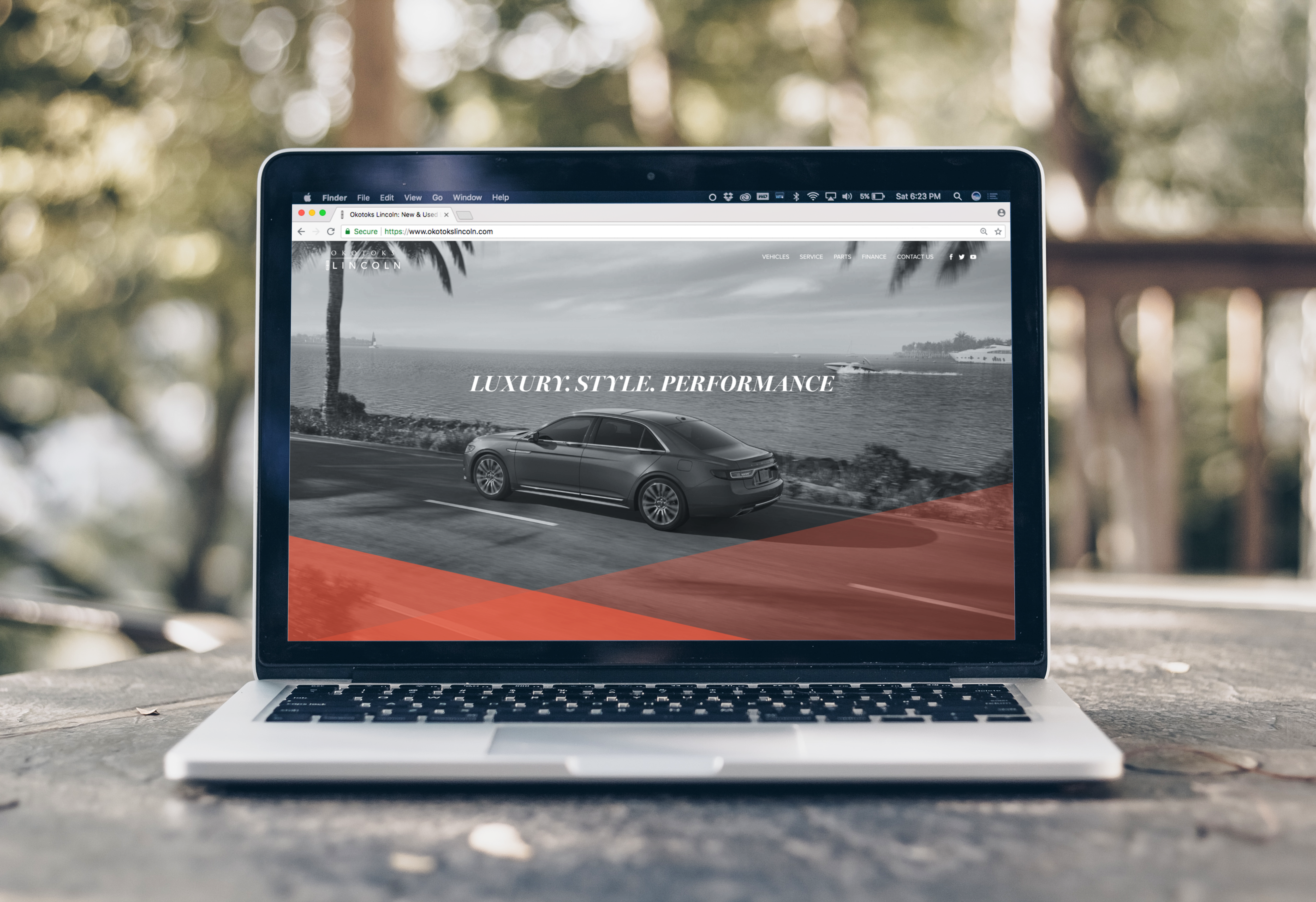
Okotoks Lincoln Website Redesign
OkotoksLincoln.ca helps potential customers become familiar with the Lincoln brand and to brings them in contact with the dealership.
It was my first job out of university and I was excited to get to work. I had graduated with a Bachelors in Web Design and Development but it wasn’t until I started working on Okotoks Lincoln’s website that my university learning was finally put to the test.


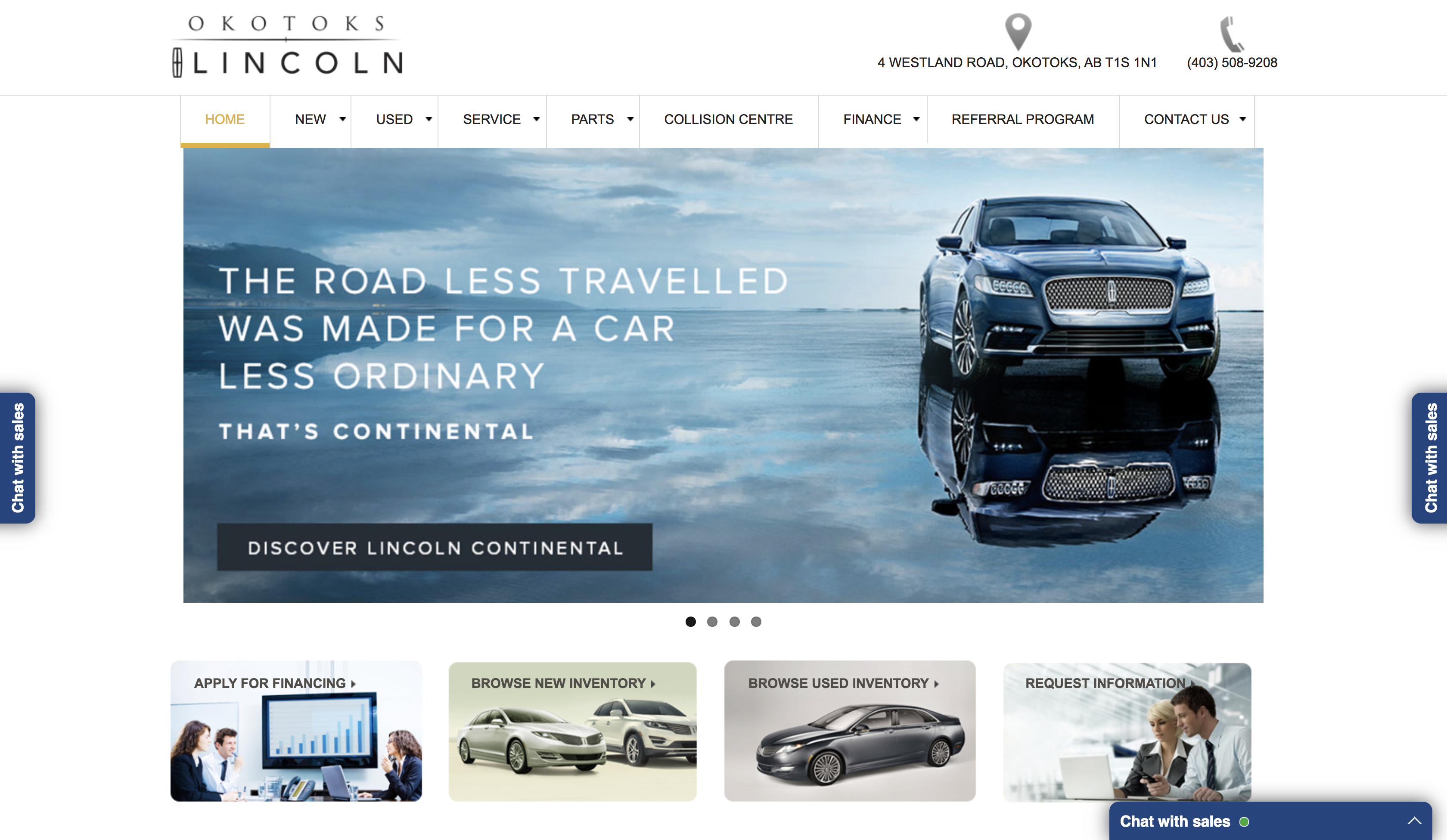
Management of the car dealership recognized that their website wasn’t properly representing the Lincoln values. It was poorly templated and difficult for customers to find information. Lincoln is a company that prides itself on their luxury vehicles and tailored customer experience. My task was to bring the dealership’s website in harmony with Lincoln’s values.
As the only designer on this project, I started out by familiarizing myself with the dealership’s culture and the Lincoln brand. The Nielson Norm Group was an invaluable resource in my research. In particular, their article, “Flat vs. Deep Website Hierarchies” helped me focus on the website’s content hierarchy and creating specific categories to increase page discoverability. Using this and other research, I reworked the main navigation to create an intuitive customer experience.

I presented a prototype of the redesigned website to the management team, walking them through the many benefits my changes would have to the customers. Their interest was peaked when they recognized that my designs clearly represented the luxury feeling of the Lincoln brand. Their interest quickly changed to excitement as I demonstrated how the prototype simplified the user experience. By the end of my presentation, they were pushing for my design to be implemented as soon as possible.
This positive learning experience prepared me for many other tough projects. I have learned the importance of in-depth product research and how user-centric design makes all the difference.
